Ok, ladies. Gather round, we need to have a chat.
Everyone is talking about Joanna Gaines new Hearth and Hand™ line at Target right now. Apparently some folks were expecting it to be a whole lot more… something. Amazing? Farmhouse-y? Shiplappy?
I started seeing a lot of my blog friends thumbs-downing the whole product line, so I had to go check it out for myself.
After flipping through the virtual pages of Target and examining every Hearth and Hand product, here is what I know to be true.
Interior Design is cyclical.
Design trends, in general, are on about a 30-40 year loop that just repeat in fresh and updated ways. It happens in fashion. It happens in hair and makeup. And it most DEFINITELY happens in home decor.
There was a time in high school when I said I would NEVER wear bell-bottom jeans, but by the time college rolled around I was rocking my “bootcut” jeans with giant frayed bottoms just like the next girl. Eventually I declared I would never own another pair of skinny jeans, but yet here I am… wearing them as we speak. (or unskinny jeans, in my case. But you catch my drift.)
Our grandmothers had hardwood floors. Our mothers covered them up with carpet. We ripped up the carpet to reveal the beautiful old hardwoods, and the cycle starts all over again.
Now I know a lot of y’all don’t want to hear this, but the 80’s are coming back quick, fast and in a hurry.
Back in September I posted my fall home tour and said this:
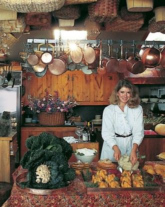
Lately I’ve been so drawn to YouTube videos of late 80s and early 90s Martha Stewart.
The warmth and color schemes of that era are starting to call my name. Maybe it’s just the pendulum swinging the opposite direction from all this white on white farmhouse style that makes me look for something different. I decided to give in to the call of The 80’s by adding plaids and brass and wood and wicker on a backdrop of hunter green to this corner of my bedroom.
Now I don’t wanna say “I told y’all so…” BUT.
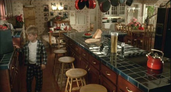
That 30 year loop thing? Yeah, that takes us right on back to 1988, when big hair and acid washed jeans were all the rage, and caterpillar eyebrows were on the cover of every Seventeen magazine. Kevin McAllister was just two years away from being left Home Alone in his green tartan pjs fixing breakfast on that hunter green tile countertop.
And have y’all seen the eyebrows on Youtubers lately? Drag queens ain’t got nothin on some of these little Youtube chicks with painted on eyebrows.
The 80s are back and Joanna Gaines knows it.
So all those hunter green tartan placemats and matte black silverware you are hating on right now? It’s only gonna get darker and more wicker-y from here.
In a few years we are all gonna be ripping out our all-white and stainless kitchens and installing walnut brown cabinets with harvest gold refrigerators.
And leading the pack, as usual, will be Joanna Gaines.
I personally am LOVING the new Magnolia kitchen line. Bring on the 1980’s avocado green, baby! It’s one of my all-time favorite colors on earth. If I had the cash lying around, I would buy one of everything in this picture. 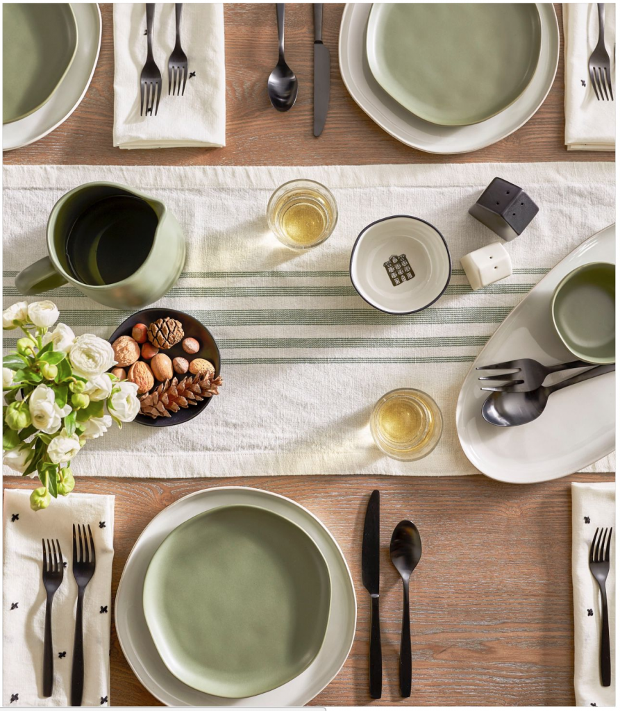
And I would hang these wreaths on my wall in a hot second.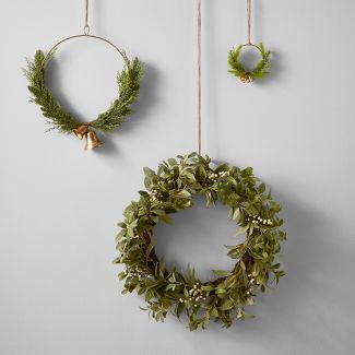
The only part of the Hearth and Hand kitchen line that I don’t like are the galvanized chargers.
I made a vow to stop buying galvanized stuff about three years ago and I don’t regret it. I still decorate with it a bit, but I refuse to buy any more of it because pretty soon we are all gonna wake up from our junky farmhouse stupor and realize galvanized buckets were made to slop the pigs and water the horses.
All the rest though? I can dig it.
So my advice to all you haters?
Go hang a pot rack over your kitchen island, fill it with copper pots and Longaberger baskets and buy one of each of whatever Joanna Gaines is selling.
She is gonna raise her green tartan flag and lead us back to the avocado green promised land. I’ll be marching right beside her teasing my bangs and blaring Poison’s “Unskinny Bop” on my Walkman.
Ok, so I wanna hear your take on it.
Have you seen it yet?
What do you think about all that matte-blackness?

I’m a huge fan of green and black plaid!!!! I thought everyone was gorgeous and surprisingly economical. ??
So, I love the black… and the sage-y green (I REFUSE to call it avocado! ;-)) The tartans… not so much… still remind me of a teal shirt and black slacks outfit I wore in 9th grade. I can’t go back!!! However, when I’m scrolling through IG or FB or Pinterest, I often stop and sigh at the black-accented farmhouse look. Bless’er House is doing lots of it, along with Mrs. Gaines. We’ll see if I ever get brave enough to use some in My Wee Abode. 😉
Thanks for the giggles and guffaws, Beth. Great read!
This cracked me up!!!! You’re so spot on!!! Love this post.
How right you are Beth! I haven’t gone totally white. Grey walls are our current go to neutral for walls but we love tradition and color too much! That said classic traditional plaids and tartan green is always a favorite! Joanne is an influencer and fortunately for the good. Personally I loved Martha’s 80’s look. Who wouldn’t love her house!
Seeing that my style is Traditional interspersed with heavy amount of English Country – I live in Plaidville daily. Bring it on. Bring on the plaid and the cabbage Rose chintz and Hunt Country foxes. I’m already there. ?
I’m laughing so hard. You really nailed it. What really killed me is how so many went and bought up everything (rae dunn style) then came home and realized it didn’t fit their vibe.
I love the line, I also know she’s going to bring so much more in. I can’t afford to go nuts when buying things so I’m very carefully picking what works for me. Knowing there will be so much more. Thanks for the giggle tonight. I love following you.
I’m with you girl! Girl is my favorite color too and I agree, design trends are totally cyclical. Awesome post!
Hugs, Jamie
Wow! You really have this figured out! I personally love it. I already have the oak cabinets so I’m set. LOL
I don’t like it. I did buy the tree collar because I still like galvanized but didn’t think the dishes were as substantial as my pottery barn dishes or sorrento stoneware. I’m not going to go back to green and black. I like the clean white look. It seems a little lacking in quality, too. I, personally, prefer Threshold. I did really like the cool “house” display idea, though.
I have not been to a Target to see the line in person but what I saw online, I was not “wowed” by it. I wonder how much control over the line Joanna actually had. The promos say that it is a “collaboration”. So many elements of “Farmhouse” are the same as those of us who were decorating “Country” in the 1980’s (except for the colors as you noted…I remember light blue and mauve as being very popular). I did buy the “Hearth and Home” wooden tool bench online and had it shipped to my grand daughter. It arrived in just a few days. That is funny that you had a photo of Martha Stewart…I got the urge a few days ago to buy her first book “Entertaining”…that photo is in it. Amazon still has new copies…are they still being published or is this old stock?
Enjoyed your post!
Sign me up! I love it. Sage green was one of my wedding colors I love it so much, and my house is full of black furniture and frames. That matte black flatware has me slightly obsessed!! Love your take on the whole situation, I agree that it is cyclical. ???
Loved your post! I was at Target when they unveiled the new line and while I liked everything, I wasn’t impressed by anything. I love Joana’s taste, don’t get me wrong but maybe she has such high stakes that we expected waaaay more. Still, it’s a gorgeous line.
PS: I’m NOT looking forward to an 80s revival! LOL
I have sage (BM Saybrook Sage) walls in my kitchen and black accents, so nothing against green here. But, I was very disappointed in the products I saw. I went in ready to buy and got nothing! Love Joanna, though.
I actually haven’t gone to see it yet nor bought any of it. However, from what I have seen online, I like it and welcome back some traditional color. I am not a fan of white on white. I haven’t jumped on that ship. Maybe I will be back in style:) I loved the post!
I lived through all these eras and if there’s one thing I’ve learned it’s that you have to know what you like and not jump on every design bandwagon that comes along. I applaud you for recognizing and choosing not to do all things galvanized. I have loved country/farmhouse styles long before the Gaines made it main line. However I drew the line at mason jar everything because it wasn’t true to me (I’ve never canned anything in my life). I won’t be tearing out my newly painted white kitchen since that’s what I’ve liked for decades, but I might try a great plaid throw here and there.
Already have tons of green in this house and I collect fox hunt thingies. lol Green is an earth color. Always in…..in my book. lol Love your blog.
Love this! So funny, & true!
I learned a long time ago that style in any area is a cycle. You can hold on to something you wore years ago and it will always come back into style. I’ve also learned that I decorate my house in the style that makes me happy not what is going on in the present. So I love farmhouse! No crazy about the white one white, but I love color with maybe some white thrown in the mix. So if you were to come to my house you would see only what makes me happy and not what the present style is!!
Oh my gosh, Beth! You are so on point with this post. And one more thing, I JUST hung a DIY pot rack over my kitchen island and filled it with copper pots. I haven’t revealed it yet. 🙂
Hilarious! And very well written.
I had to really stare at the photo of Martha Stewart. I’m not familiar with her with longer hair.
The kitchen cabinets behind her really were interesting. I’ve seen a lot of houses with those still in them. Nothing has been changed for decades, because a kitchen makeover is so costly as to be out of most people’s budgets.
That house from Home Alone was a rather large, extremely expensive house. The counters reminded me of some Park Avenue real estate listings I looked at two weeks ago. The apartments were millions of dollars and gorgeous, but the kitchens had tile counters still. (I had tile counters in my last house, and they drove me nuts; you can’t roll out dough on them!)
I love the comment above about mauve and light blue country kitchens; I’ve seen that in homes too (with light blue carpet and honey oak furniture).
My grandmother’s house was a time capsule from the late 60’s/early 70’s. She had brown and orange large floral curtains, an orange and white checked linoleum floor, orange shag carpet, avocado green linoleum, and dark paneled walls. I was at her house watching “That 70’s Show”, looked around me, and realized how perfectly the set designers had captured the era.
I was at Target the day the line came out. I looked at it. It’s nothing I want, but then, I don’t tend to decorate according to the latest trends and my home decor budget is extremely limited (mostly to garage sale finds). I’m more traditional; I like dark wood furniture and hardwood floors. I like red. I don’t change things out much, instead preferring to keep things the same and only add seasonal flowers and fruits. My blog isn’t about home decor, but I’ve had a number of requests for me to share home photos. I don’t know how home decor bloggers keep things clean enough to take photos, but then, I have 8 children and I homeschool. so we’ve got a lot of messes going all day (and my house is a pretty open floor plan, which means I have to have a lot clean at once for photos).
I didn’t like it at all. That being said it’s one thing to not like it asthetically but another due to quality.
The items are poorly made. Very cheap feeling dishes, flatware that doesn’t pass the scooping ice cream test and linens that aren’t sewn well. If it’s poorly made it loses all credibility.
And I just don’t see Joanna as having designer foresight. She knows Farmhouse because she likes it and loves it. Some design team thought this up and she slapped her name on it. That’s what all celebrity “designers” do. You know, the ones without one ounce of training.
And PLEASE let the pallet phase go away fast. I grew up on a fruit and vegetable farm and pallets are for loading produce on and not for decorating your living spaces. YUCK.
And drinking out of mason jars? Good grief – those are for canning; glasses are for drinking.
I checked this out at Target last week and was pretty underwhelmed. I agree that many of us are over the white on white… but forget the color palette, the stuff is just so boring in terms of design. There’s no personality to it. I honestly found the dollhouse to be the most interesting item.
You can pry my beautiful white kitchen cabinets from my cold dead hands. For real, I’ve been drawn to whites and grays since I was a kid (and my mom will claim she’s been decorating with gray for 40 years). So Joanna can keep her moody avocado and black and I’ll keep decorating like the beach loving girl I am!
I checked out almost every item at Target. Everything was so cheaply made and very unimaginative. The black silverware was bendable. Plastic knives and forks are probably stronger. Dollar store quality at inflated Target prices. The ship lap, wood pallet, mason jar, galvanized bucket and toolbox trends are hopefully all going back to the barn or storage sheds. Creativity, color and comfort should become the new decorating craze.
HA! You make me laff! I am neutral (no pun intended) on the collection; I neither love it or loathe it. I’m just not into buying so much small stuff these days, but I would love to have a pair of brown leather chairs. Go big or go home!
Count me on the unimpressed list too. I guess I expected more versatility but it is just the beginning and I know there is more coming, so I ain’t giving up. Right now, it’s just so one dimensional. Even the in-store displays feel that way. And then there’s the odd piece thrown in like the leather gifts and the wooden cocoa set. I loved her stuff at Bed Bath and Beyond, although those prices were ridiculous.
Rose Christo says:
Yah,nothing is new. Just new Tricks to Fool the eyes senses 🙂 Hey I’m for everyone making a buck or two.????
Yah, nothing is new.Just new Tricks to Fool the eyes senses 🙂 Hey I’m for everyone making a buck or two.????
LOL…your so funny! I wish I could write like you! I did do an Instagram post on her line when the line came in. I liked some of the pieces, like the Doll house and some of the galvanized candles and stuff I do love anything metalish. I think I wasn’t into black and green for Christmas but I’m hoping all find more that I will find appealing in the Spring or Summer lines. My family did buy me some of her candles from the Hearth and Hand line and they are a little weird how they are burning. they have like this plastic around it and its melting in an ombre way…I know this does not make sense but I can’t quite explain it. I was there again yesterday seeing if any new spring stuff came in. Lots of organization stuff…don’t need it.
Ooooo I haven’t seen the Spring stuff yet– I’ll have to go check it out!
IT’s not the look I struggle with. It’s the quality. All my items I’ve bought from Magnolia at Target have broken